給於肝肝工程師小額捐款'v': ETH/ERC20

參考資料:
六角學院
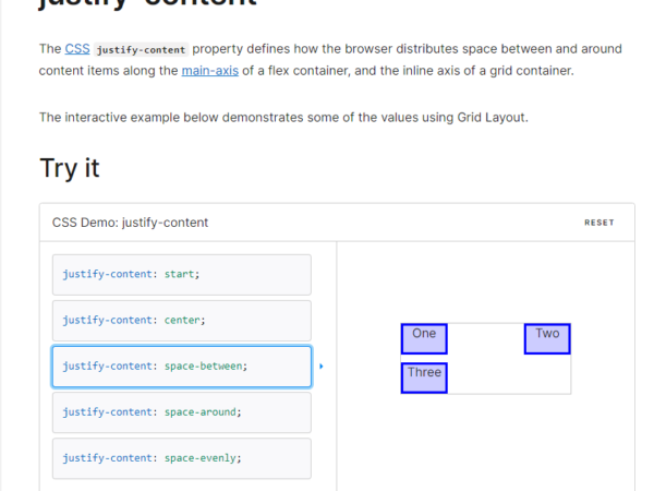
https://developer.mozilla.org/en-US/docs/Web/CSS/justify-content
MDN_WEB 網站提供的測試範例

https://developer.mozilla.org/en-US/docs/Web/CSS/justify-content
複習軸軸
我們再複習一遍主軸是甚麼?

主軸方向flex-direction先確認!
Row 方向
HTML 文本
我們今天更改的範圍是 : container
<!DOCTYPE html>
<html lang="en">

<head>
    <meta charset="UTF-8">
    <meta http-equiv="X-UA-Compatible" content="IE=edge">
    <meta name="viewport" content="width=device-width, initial-scale=1.0">
    <link rel="stylesheet" href="CSS/Flex-justify-content.css">
    <title>Flex-Direction </title>
</head>


<body>

    <div class="container">

        <div class="item item1">1</div>
        <div class="item item2">2</div>
        <div class="item item3">3</div>
        <div class="item item4">4</div>
        <div class="item item5">5</div>

    </div>

</body>

</html>
CSS_Ver1.0
.container {
    display: flex;
    width: auto;
    height: auto;
    background-color: blue;

    flex-direction:row;
}

.item {
    width: 150px;
     height: 50px;

    background: #00ffa2;
    color: #033b56;
    font-style: initial;
    text-align: center;
    font-size: 35px;

}
Flex-direction =row >> 從左到右
來看看Justify-Content
space-between 方法
CSS_Ver2.0
.container {
    display: flex;
    width: auto;
    height: auto;
    background-color: blue;

    flex-direction:row;
    justify-content:space-between;
}

.item {
    width: 150px;
     height: 50px;

    background: #00ffa2;
    color: #033b56;
    font-style: initial;
    text-align: center;
    font-size: 35px;

}
flex-start 方法
CSS_Ver3.0
.container {
    display: flex;
    width: auto;
    height: auto;
    background-color: blue;

    flex-direction:row;
    justify-content:flex-start;
}

.item {
    width: 150px;
     height: 50px;

    background: #00ffa2;
    color: #033b56;
    font-style: initial;
    text-align: center;
    font-size: 35px;

}
其實就是保持flex 效果的原狀態。
結語
在測試順序上, 我們大多從Flex-direction 開始定義
之後再去調整Justify-content, 藉此調整主軸排列方式。
有順序概念會比較不容易搞混!